Index Prototype
We are currently in the design process of the third phase/lens of our data visualisation project Loom. This phase has always been about exploring the rich amount of metadata that we have in all the databases that are associated with the locations around the Sydney CBD. Looseleaf is the visual entry into the data, Atlas is the bird’s eye location, map view of the data and our third phase is all about the data and possibly the most complicated to design and to make into a meaningful and useful interface.
“For me the most compelling view of Loom is the third view as it tells a story about this history of Sydney, the representation of the city in different formats and the Library system that has catalogued and described the material”. Lousie Denoon, Senior Curator, Research and Discovery, Library and Information Services.
In this process, a prototype tool has been built by Grumpy Sailor to demonstrate the potential of the amount of data that we would be working with. We are tentatively calling this the Index prototype. Part of our design process is to publish our research and findings so that you get an idea of what we are working on and towards and how this might be useful to different developers, researchers and our users.
We asked James Boyce from Grumpy Sailor to share some of this research.
What data is this prototype pulling from for the third design phase of Loom?
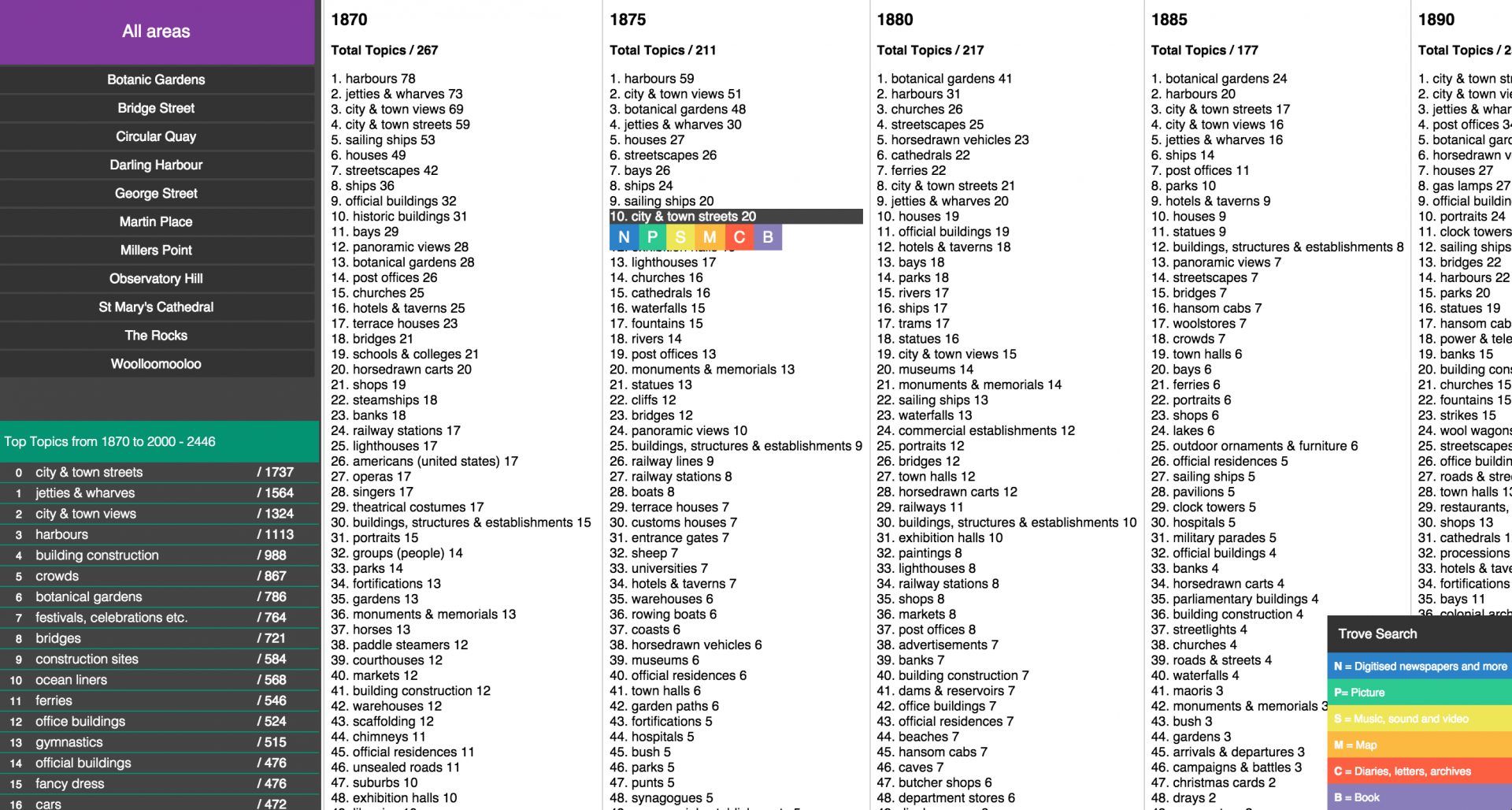
This prototype looks at the data associated with archives within the library’s collection, rather than at the items themselves. In this prototype, Index, we pull topic data from archives between 1970-2000, across 11 specific locations. Index looks to correlate data and trends in the library’s collection, based on the topics items have been tagged by. For example, did the commencement of the Sydney Opera House construction in 1976 result in more acquisitions tagged with architectural or building tags?
Rolling over a topic also allows the user to uncover related content found within Trove, an external database to ACMS. The intention here is to aid a user in drawing connections between data sources that may support an interesting trend. These external links to Trove have been broken down into newspaper articles, pictures, music, maps, diaries/letter and books.
We asked you to pull in another meaningful set of data that was not from the Library. Can you describe the process that you went through finding data sets and how you settled on pulling in the various formats from Trove.
In the early stages of creative development, and in discussing what Phase 3 Loom would look like, there was interest around using external data sets to highlight story threads within the ACMS. What other data out there would add a layer of depth to the project, giving it an interesting spin that entices a user to dig further?
The ABS was of particular interest, with data dating back to the early 1900s. Imagine if we could correlate population data with the top topics from the ACMS; what stories could we tell?
With further research into the ABS data, the challenge was in how we could display two very different data sets together and show a clear relationship. It proved quite complex with the ABS, and although there are some great statistics on population, businesses, transportation, it did not look to strengthen or support the data we were pulling from ACMS.
The original objective of Index was to shine a light on correlations though anomalies or spikes in the data, and so we realised that the ability to reveal the contemporary context around these spikes would be incredibly complimentary. As such the idea of using Trove came about. Trove would act as a secondary data set, existing to explore an interesting spike in a topic, in a certain year, and allow the user to browse further resources around the particular topic, in the hope that some interesting correlations could be made.
What are the challenges now of taking the findings from this prototype and designing this into the third phase for Loom.
Getting to this point with the data, and being able to visualise it in such a simple way has been hugely beneficial as we move into the UI design and experience phase. It has allowed us to better understand the data we are dealing with and what this data looks like across time and location.
The challenge as we move forward, is how we take what we have learnt and create an immersive, visual experience that builds upon the prototype without losing the simplicity and key objective of the visualisation; to create an experience that is intuitive to the user, and allows them to clearly navigate through the data revealing interesting stories as they go.
As well, not all topics are going to have related content to uncover within Trove, so as we continue we must ensure that there are some useful insights from the Trove searches we are making data calls to.

Are there any technical challenges around designing with this much data?
Technically we are not doing anything unknown in Phase 3 of Loom. The challenge is more from a visual point of view: with over 2500 topics, many of which only have 1 or 2 counts attached to them in a given year, how do we make it consumable to the user ensuring there is enough interesting elements that they become immersed in the experience?
If you have any feedback on how we can progress the Index prototype, we would love to hear about it.

