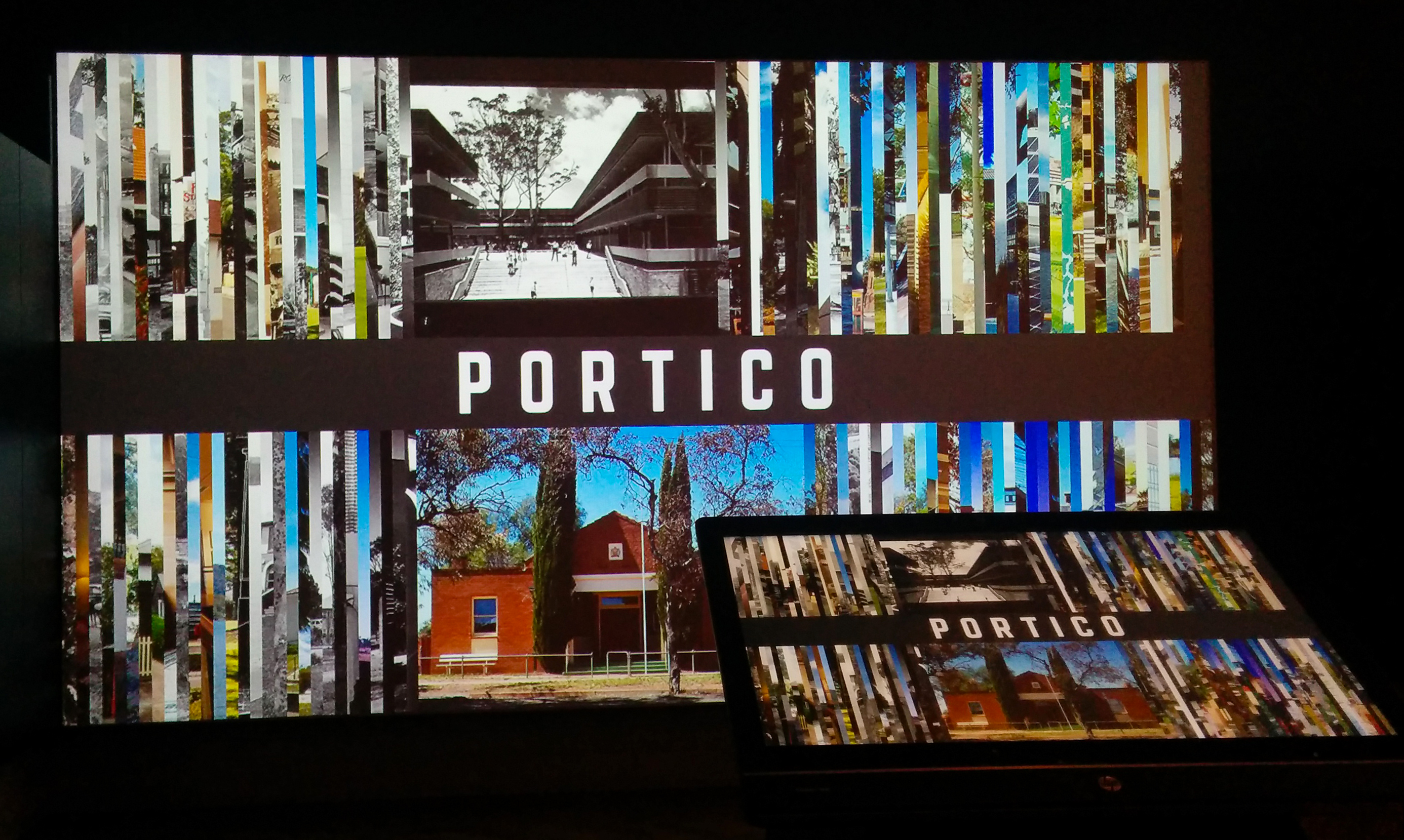
Portico
Portico is the DX Lab’s latest experiment. This digital experience is an in-gallery touch screen interface with a large-scale projection featured in the exhibition Imagine a City: 200 Years of Public Architecture in NSW. Our brief was to utilise the online interface that we had built for Mainstreet with new content supplied from the Government Architect’s Office and turn it into an onsite experience. One of the DX Lab’s design principles is to iterate and this is what we have done with Portico. We wanted to see how Mainstreet could become a physical onsite experience using new data. (A responsive web version of Portico is also available)
Visitors can use the touch screen to open each image slice and get a ‘City and State’ comparison of buildings produced by the Government Architect’s Office based on time. It is effectively a large time-line. Each image is captioned should the visitor want to find out more about each building. If a visitor doesn’t want to drive the experience then they can rely on the animation that we have applied to the work that will open images in a non-sequential way.

Technical Stuff
Some of the technical issues that we wanted to address with Mainstreet included: functionality and optimisation. Portico has a completely different codebase to that of Mainstreet and went through two iterations before we finalised the interface. The changes included:
- a vast improvement upon Mainstreet, utilising a modular approach and encapsulating code as local resources. The application also utilised additional third party framework’s such as requirejs, Backbone.js and underscore.js to provide a procedural structure to the application’s life cycle. During development a task runner was used to automate basic tasks, thereby increasing throughput and significant improvements were immediately noticeable.
- Improved performance, specifically in Google Chrome. However, janking was still an issue during animation/transitions.
- The JavaScript and CSS was minified with each resource type having a single entry/load point.
- The development efficacy was greatly reduced.
The second iteration required a large overhaul to the codebase in order to tackle the janking issue, the primary cause being that the application had too many complex pixels to animate/transition at once. The images had already been compressed at this stage and even if they could be compressed further wouldn’t have much impact. The next logical step was to integrate a server-side image manipulation library in order to scale and crop images served to the application dynamically. Utilising such a library would provide the ability to show the original version of an image on demand, and display the cropped version for the slices. In effect reducing the number of pixels to animate/transition at any one time. This resulted in completely solving the janking issue.

