
Unstacked microfiche experience
The DX Lab has just taken delivery of a very old piece of technology, a microfiche reader. Why would we do that?
We are really interested in experimenting with a range of technologies but what really excites us at the moment is the mixing of analogue with digital to create experiences that are quite unique, playful and unexpected.
Our previous DX Lab fellows, Adam Hinshaw and Elisa Lee had pitched a physical + digital experience as part of their fellowship research. One day as we were walking through the stacks giving Adam and Elisa a tour we came across quite a number of microfiche readers behind the scenes. These were being kept for spare parts for the actual microfiche readers still used in the reading rooms today.
We were excited by the idea of mixing up old and new technologies to create a new experience that showed Unstacked in a completely unexpected way. We checked with the Information and Access team who gave us one of these old microfiche readers to experiment on.
Luke Dearnley, DX Lab Web Developer asks Adam Hinshaw some questions about making the Microview 3000 become a digital experience showing Unstacked.
LD: You have done a great job of retrofitting an old Microfiche unit to display (and allow users to navigate) a special version of the Unstacked web site. To look at the unit you would never guess there is a video projector, a Raspberry Pi mini-computer, a Wacom tablet and more, somehow crammed in there. Tell us about the challenges involved in getting all that hardware into the old unit?
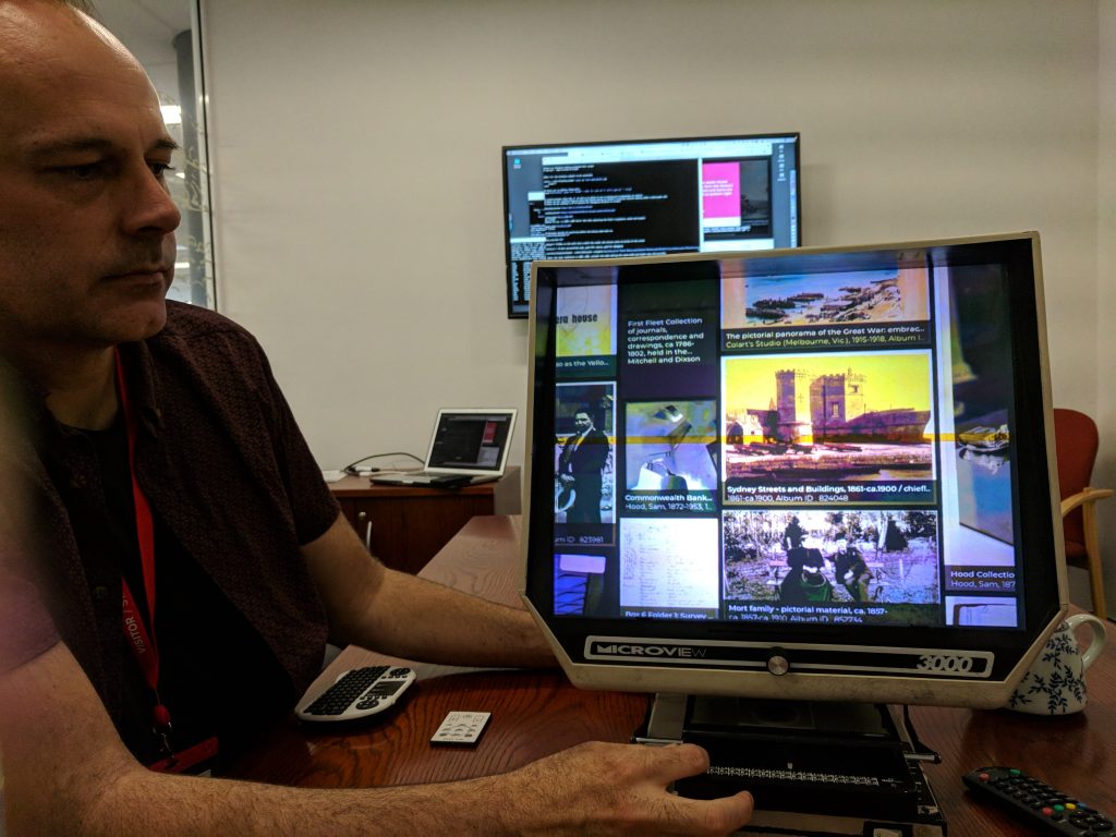
AH: Thanks, yes it was quite a challenge. Without a doubt, the biggest task was making everything fit in there! Getting all that modern hardware compressed into a machine from well into the last century that had minimal physical space available and some functional limitations wasn’t easy. This hardware layout process becomes similar to packing the car before a family road trip, putting everything you need around the vehicle and working your way through it piece by piece, visualising where things would best be placed so other things could be squeezed around them and they’d be accessible to whoever needed them at a certain part of the journey. It was a considered game of electronic retrofit Tetris.
A key issue within this was shadows. As we are replicating the optical set up of the original unit by bouncing projected light off a mirror and onto the perspex screen, and that most of our hardware and cabling had to reside in this light path, needing to have everything tucked, trimmed, and fitted out of the way to avoid throwing shadows on to the screen was crucial. We had to find ways to minimise the size of everything, and also source adaptors that could angle the cables in more suitable directions.
LD: How did you end up deciding on a Raspberry Pi to run the unit? What were the positive and negative things you encountered during set up?
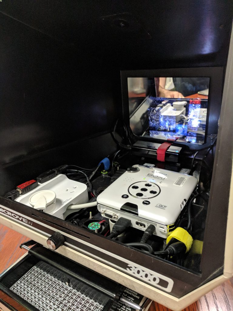
AH: We needed something small that could run the Unstacked visualisation, output to a projector, and potentially read from several different sensors for the physical interactivity. Intel NUC form factor PC’s were investigated, especially when looking to get more CPU power at once stage. But they were all just a touch too large to fit in the space available. Also, the idea of using an Apple iOS device was floated briefly, but as it was vital to have good customisation and control of the device for configuring things like scheduled power management and other low-level controls needed for a permanent install, they were ruled out. Which brought us back to the PI, its small form factor and low energy requirements are key to its suitability for these type of projects, but its killer feature for us was the fully open source Linux based software stack. Being able to run both web server and browser on the same tiny device, along with a bucket-load of sensors and consumer hardware is crazy. We are definitely living in “the future” these days with the size, power and price of computing that we have at our fingertips.
The only negative to the PI for us was we could have used more CPU and GPU power to increase the animation and interaction performance. This is a pretty common need though, nearly every graphics based project we’ve worked on could use some more power at some stage. However, these kinds of limitations can be positive in that they force you to focus on the core of what you are trying to achieve with a project. As we were trying to show the diversity and rhythm of the library’s collection and its users, we decided to make some trade-offs with data complexity. Not being able to simultaneously show the thousands of catalogue views the library’s website has every day at an acceptable frame rate, we chose instead to use a reduced data set from the previous day’s access history. This gave us that right balance between information breadth, interactive response speed, and animation performance.
While our end result is not as fast as whipping around 1930s electoral rolls on a traditional ‘analogue’ Microfiche reader, it’s pretty close and we think not too shabby for a first of its kind prototype Frankenstein device.
LD: You built a pretty sophisticated screen calibration system. Can you tell us why it is needed and how it works?
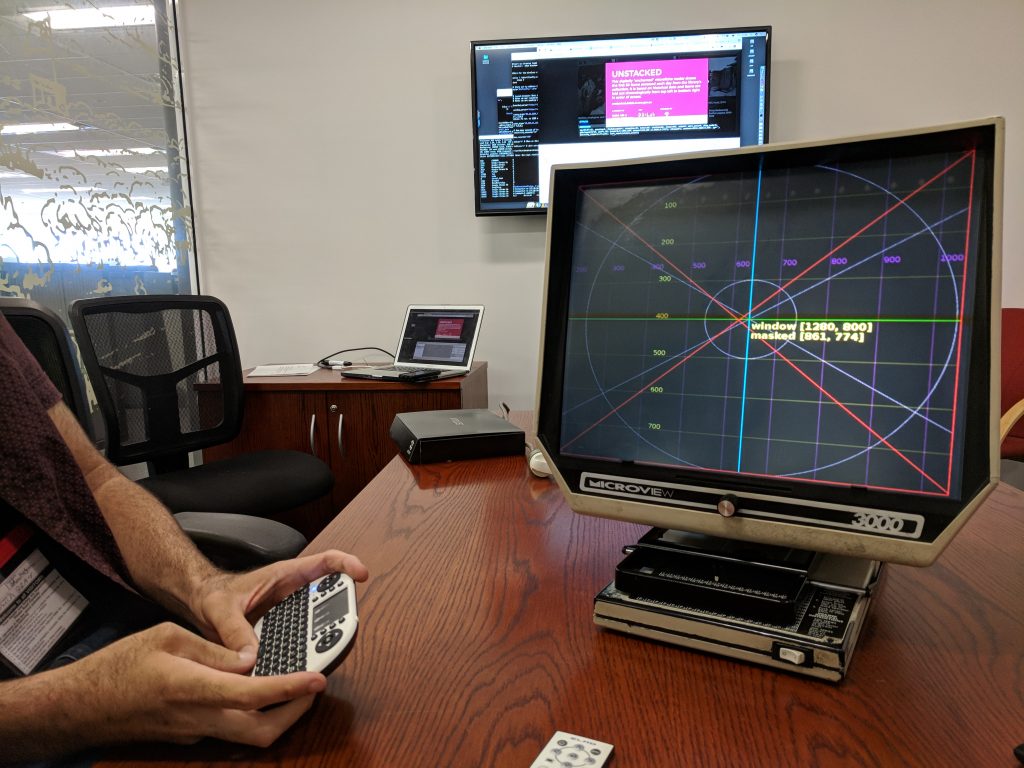
AH: Sure, whenever you point a projector at something you’re probably going to need to calibrate it. This is the process of tuning the projected image to mesh with the physical object it’s being projected onto, it’s often about getting your lines as straight and squared as possible. But in our case, we had few extra needs that required a special calibration system be developed.
The Microfiche reader has a unique, almost square ‘postage stamp’ aspect ratio, and our 16:9 micro projector is ‘over scanning’ this considerably. This means only a portion of the Raspberry Pis desktop is visible while the rest is being projected internally onto the angled sides of the housing. This created a lot of unwanted bouncing light inside there, resulting in visible bands of the desktop appearing as ghostly artefacts on the edges of the screen. We needed a way to eliminate this visual noise and came up with a simple masking technique to crop out the unwanted light which required a means to measure and alter this mask’s dimensions.
Also as we are housing our projector inside the ‘monitor’ section of the Microfiche reader, an area that formerly held no components and was never designed to have the same sturdiness of the unit’s base, making the projector mount susceptible to a bit of flex, especially when the unit is moved or maintenance is performed on it. Therefore the projector may go out of alignment and require recalibration often and if there is something you are going to have to do semi-regularly you may as well make a tool to help you make the process as simple, pain-free and efficient as possible.
As well it’s always fun to whip up some purely functional code based ‘developer art’. The colours don’t need to match a style guide or follow the golden ratio, they just need to work as a means to measure and be clear and bold.
LD: How did the idea of using a Wacom tablet as the pointing device come about? What challenges did you have to overcome in implementing it?
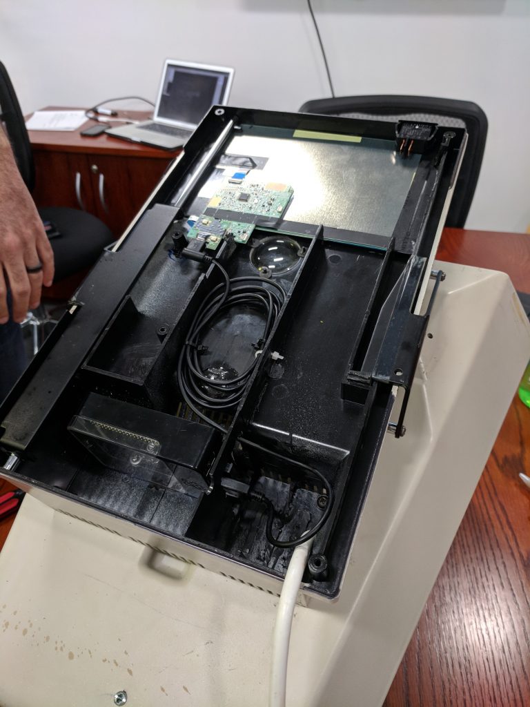
AH: Using a Wacom tablet and pen was originally the idea of the DX Lab’s Paula Bray. We were brainstorming sensor ideas during our Fellowship, and Paula made the connection between the Microfiche reader’s navigation device and a Wacom tablet. This turned out to be a golden moment. With guidance from Dr Bert Bongers from the Interactivation Studio at the University of Technology in Sydney we looked at a number of other sensors but ultimately locked in on the Wacom. Given it’s an easily accessible and affordable consumer device that has mature software drivers, needed minimal wiring and has a workable input method of translating mouse events made it the perfect choice.
The task then became finding a tablet the perfect size to fit both the interaction area and physical space available in the reader. Once we’d found the Wacom model that seemed made for us, the true challenge presented itself, this was dealing with the physical clearance of the unit’s moving parts and the tablet’s electronics.
The unit’s primary means of interacting is a sliding handle that moves upon a steel rod along both
the X and Y axis and the space where the tablet’s circuit board needed to be mounted coincides with this main moving component. If you can, imagine trying to mount an iPad on the floor beneath the gap of a swinging door, and this doorway sees a lot of action. How can you make it so the iPad does not get scraped into oblivion (or stepped on) and still have the door swing freely? We achieved this by spending a lot of time with a Dremel tool, carefully removing steel and plastic, iterating over and over, until the sweet spot of just millimetres of clearance was found. So the handle moves smoothly and the table circuit board is safe from being torn apart.
LD: Is there anything else you would like to tell us?
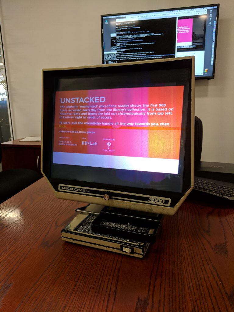
AH: Yes a hot tip, from personal experience you can get a lot of hipster points carrying a Microfiche reader around the city! Possibly it’s time is due, like the cycles of vinyl and cassette tape, to make a cool resurgence as a medium. We hope to soon see people sitting on the train, skimming through their social feeds on their own portable but cumbersome Microfiche reader. ;-)
Seriously though we think this digitised Microfiche reader could have lots of further application and exploration beyond Unstacked. Also if you have never used a real Microfiche reader, we recommend having a go, the library has a few still in operation. It’s a great experience to see how fluid and swift this ‘old’ technology is and how in some ways better than what we use now for similar tasks.
Our thanks to the DXLab for having us back and giving us the opportunity to build on to our original fellowship project. Remember to keep it Unstacked.
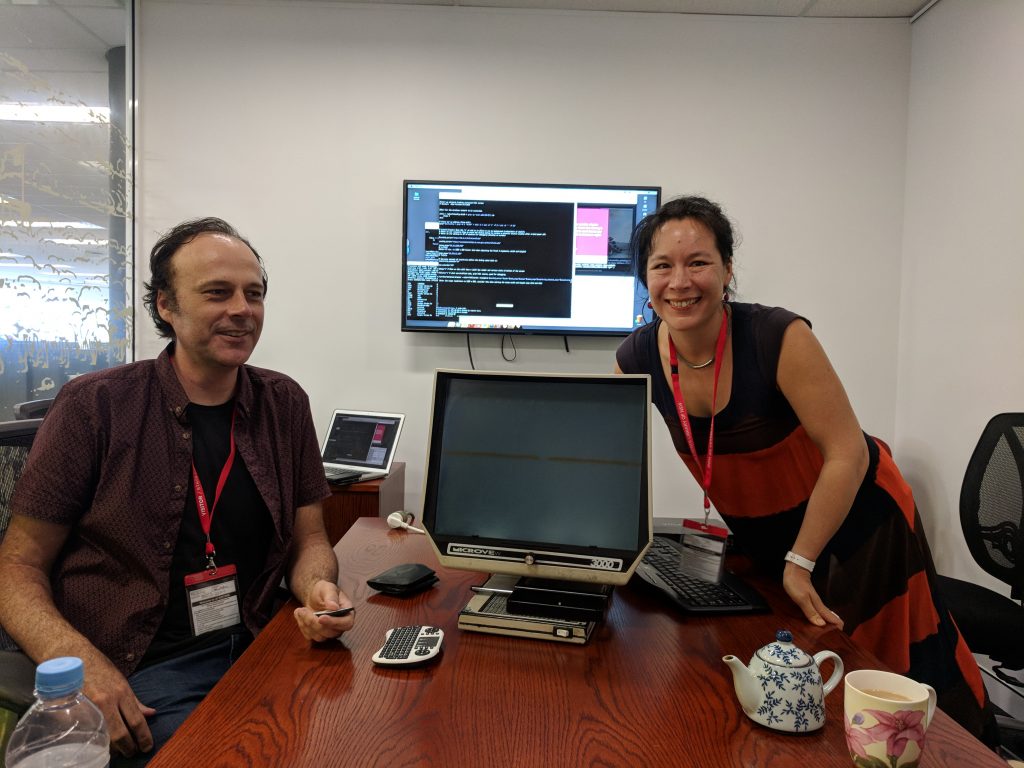
Inaugural DX Lab Fellows Adam Hinshaw and Elisa Lee.
This experience is no longer on display, as the DX Lab has closed.

