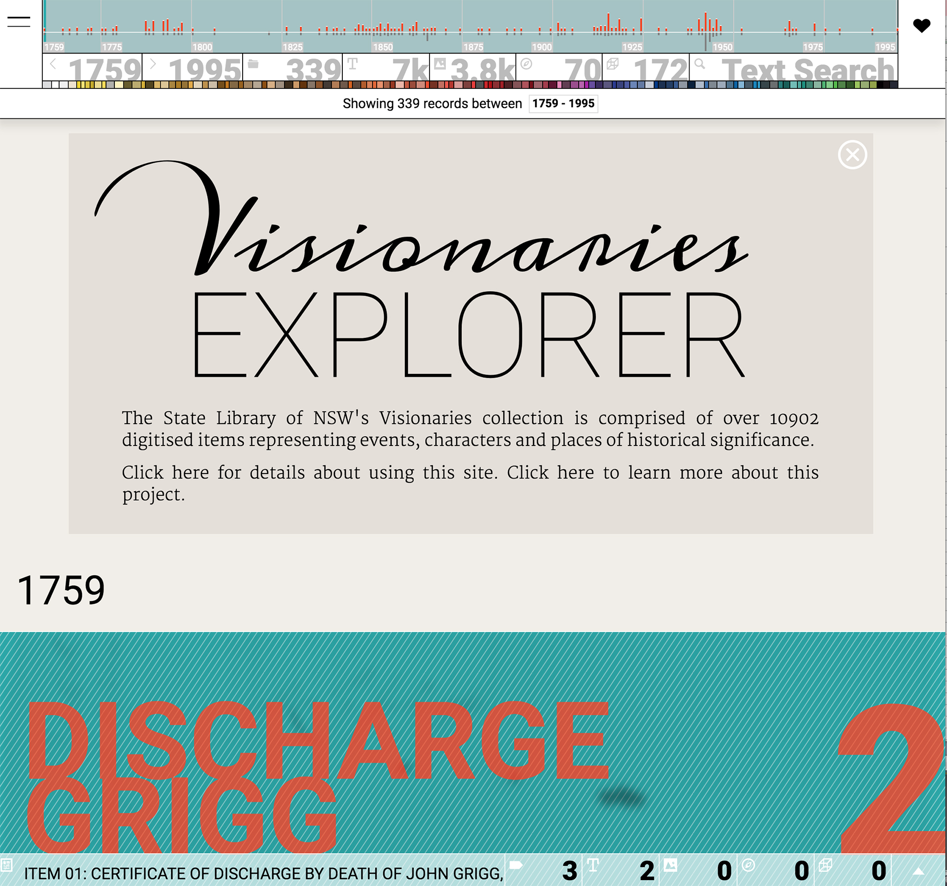
Visionaries Explorer
Post by Geoff Hinchcliffe, Digital Learning Fellowship winner.
The Visionaries collection is a curated set of items drawn from the vast State Library of NSW catalogue. It consists of 375 records, each containing digital scans of artefacts such as books, artworks, photographs, medals and badges. Each record contains between 1 and 400 scanned images, with a total of over 17,000 images in the whole collection. The Visionaries set has been created with secondary students in mind, especially those completing their HSC in English and History, and accordingly all of the materials represented refer to significant Australian events, characters and places between 1759 – 1995.
This is a summary post about the project which I completed for the DX Lab’s Digital Learning Fellowship. My role was to build an online site for the Visionaries collection. The post is structured around the site’s four main components, and in each section I step through some functional detail and offer a few thoughts on the final form and function of the work.
1: Header

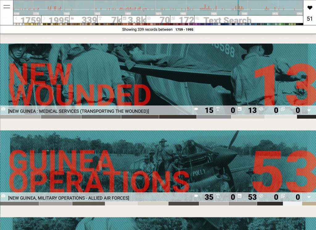
The Visionaries header section is part data visualisation, part infographic, and part user interface. It provides an overview of the whole collection and some useful tools for searching and filtering. The main component of the header is a histogram showing the full 236 year time span of the collection. The vertical bars indicate the quantities of records (grey) and images (red) in each year. The histogram also provides useful ways to focus and filter the collection: click on a bar to show records for that year only; click again to de-focus. The green highlight bar indicates the scroll position of the main window. As you scroll down the page, the green highlight bar moves across to the year currently in view.

Below the histogram is a strip of tabs. The first pair indicates the currently selected period. These dates can be adjusted to select any range between 1759 and 1995. Next to the date range are tabs indicating the number of records, and item types (pages, images, maps and objects). Each of the item type tabs can be clicked to filter by that type. The final tab is text search, which works in the usual way (enter a word or phrase) and can be used in combination with other active filters.
Immediately below the tabs is a colour band featuring a row of swatch segments. These are the main colours drawn from the 17,000 images of the collection. Click on a swatch to filter records by that colour. Colour can also be used in combination with other filters. Finally, the text line below the colour bar lists the currently active filters and allows filters to be removed individually or cleared as a set.
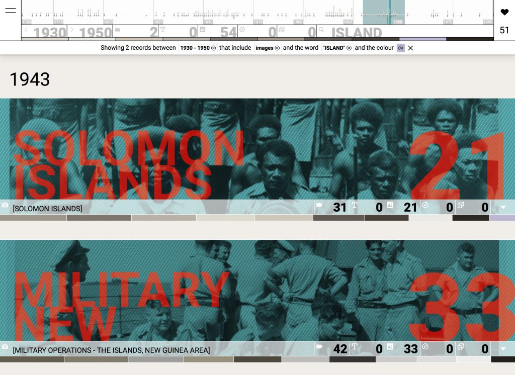

All of the header elements are dynamic, changing to represent the current selection of records. In this example, the date range is set to 1930-1950 with filters for images, the word ISLAND and a colour swatch. The figures in the tabs have updated to indicate 2 records are available including 0 pages, 54 images, 0 maps and 0 objects. The histogram highlights the currently selected period and its vertical bars adjust to indicate the quantity of matching items. At the bottom of the header, the text line summarises: “Showing 2 records between 1930-1950 that include images and the word ISLAND and the colour []”.
While Visionaries is far from “big data” scale, its set of 17,000 images is too large to be casually browsed. The typical way into a collection of this scale is through text search. It’s an extremely familiar mechanism but doesn’t work so well when you’re not sure what you’re after or you’re unaware of what else might be lurking within a collection. The header offers other ways into the Visionaries collection, ways that support a more curious and open ended investigation. It gives us information about the whole collection and from it we get a sense of the collection’s scale and shape. We can see that 1865 has a lot of records (28) with relatively few images (28); 1915 has a lot of images (780) but relatively few records (7); and 1942 has plenty of both (76 records, 803 images). We can also see that the collection items are concentrated around particular dates (which will be very relevant to history students prepping for the HSC). All of these clues allow a reader to orient themselves before diving into the collection. And when they do take the plunge, they can use the different header tools to zero in on particular content or pursue a lighter, more serendipitous pathway through the collection. Colour is probably the best illustration of this open approach. It encourages playful investigation and can reveal gems that might otherwise remain hidden from view.
2: Records
Records are at the heart of this work but they can be tricky. The main issue is that records are often not particularly evocative of the content they represent and as a result, there’s a real danger that people can overlook valuable content. A key aim when designing the records was to address this issue by surfacing more of the rich character of the items held within.

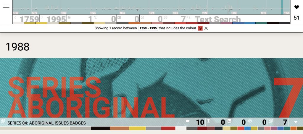
Each record presents a tightly cropped slice from one of its images, which is desaturated of colour, tinted green and overlaid with a light crosshatch texture. A large two word title is set in an opposing high contrast red with a slight translucency. This combination of text and image is a modest example of remix & reuse – using archival materials for creative production rather than solely for their historical content. The purpose here is to provide a sense of character rather than offering a complete representation. It’s about drawing attention and enticing an audience to investigate further.
The information below the banner image offers a brief summary of the record. The strip of tabs on each record are much the same as those in the main header, listing the quantities of item types (text, image, map, object). And as with the header, clicking a tab activates it as a filter but record tabs apply only to the current record rather than the whole collection. The other tabs feature the record title and the number of tags (more info about tags below). The colour bar also operates like its counterpart in the header, but applies only to the record not the whole collection.

The visual techniques employed in the record design (bold title text; rich textural background; colour saturated image; reduced palette; complementary opposites) draw obvious influence from book cover design. Over the course of the 20th century, book designers have developed robust visual systems capable of accommodating changing text content and delivering striking visual outcomes. Those same techniques have strong relevance in the web setting. In the design of the Visionaries records I’ve adopted similar visual design rules but enact them with code. The compositions are rendered live in the browser and both the image slice and title are generated randomly – reload the site and each record will be redrawn with a different title, image, and cropping. Serendipity is a powerful ally and it’s remarkable how satisfying a simple combination of text and image can be.
The visual effects evident in the record design are a clear indication of the advanced capabilities of modern browsers and their display language; CSS. Powerful image editing operations that were once the exclusive domain of apps like Photoshop can now be realised in the browser using CSS. And that simply means more options for designers working with web media :)
3: Record viewer
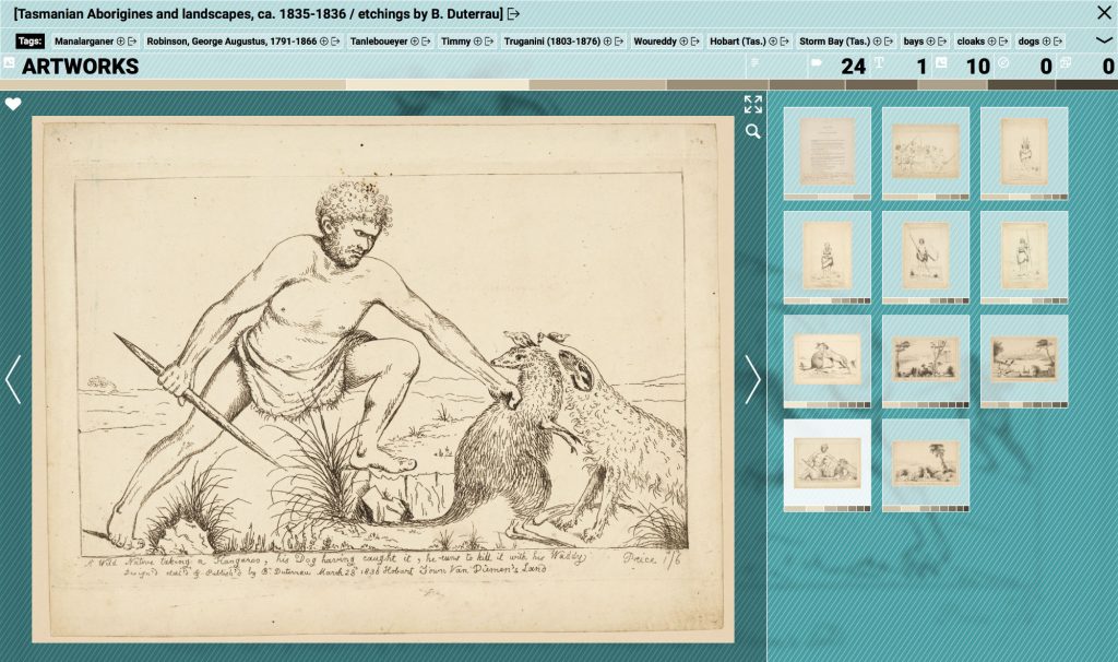
The record viewer presents a focused view of a single record. It’s composed of three sections: metadata, focused image, and thumbnails. The metadata is presented in the top section, the focused image in the lower left column and thumbnails in the right column. The metadata section displays record data such as title, tags, and summary stats regarding item types. Working with collection data like the Visionaries set, it’s essential to deal with great variability in data (some records with almost no metadata, and some with copious quantities) and so the top meta section adjusts to accommodate the volume and types of data available.

The title and tags both include a small arrow icon, which when clicked, will link across to the relevant listing in the proper library catalogue. This kind of cross linking is trivial to implement but extremely important for providing context. It’s very easy for a work like Visionaries to exist as a self-contained site but one that is ultimately marooned without connection to other systems or source materials. Cross-linking is a vital bridge that allows readers to continue their exploration in the full library catalogue, and in this way, Visionaries acts as a gateway to the main library catalogue.
Clicking a plus icon on a Tag or Keyword applies the tag/keyword as a filter within the Visionaries site. Tags are generated by the State Library catalogue whereas keywords are derived from the Visionaries dataset and represent the most commonly used words in the collection. They have a functional role, allowing a reader to filter the collection but like the histogram and colour bars, they also serve as a form of collection summary – giving us a sense of the textual character of the collection.
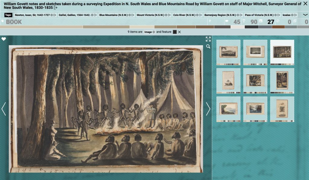
The strip of tabs and colour swatches at the bottom of the meta section operate in much the same way as the tabs and colour band in the main header. The tabs list the quantities of item type (text, image, map, object) and the colour band represents the main colours of the images within the current record. Clicking a tab or colour swatch activates it as a filter. Filters within the record viewer apply only to the current record, whereas the main header filters apply to the entire collection. So, if viewing a record of a book with hundreds of pages it is possible to use the record tabs/swatches as filters to show only those pages with a particular item type (text, image, map, object), or a particular colour (or combination of both).
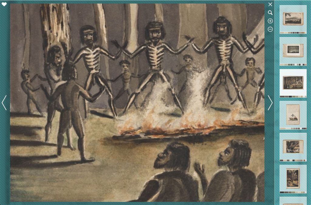
The icons in the feature column all operate in conventional ways: clicking the heart icon adds the current image to a faves list (more on that below); the expand icon expands the feature column to occupy most of the window; and the magnify icon zooms the current image to a larger scale. Using the expand and magnify options is a great way to get a generous view of the beautiful images of the Visionaries collection. The rich visual qualities of the images give a strong sense of the amazing physical artefacts they represent. Spending long hours with these collection images was a real benefit of this project.
4: Faves
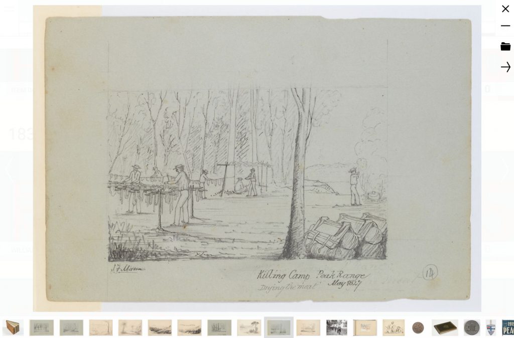
The heart icon represents faves. Click the heart icon on an image to add the item to a basket of favourites. The number of items in a faves set is shown in the main header, below the heart icon. Click that icon to view the faved set. The faves viewer is centred around one large feature image with a scrollable row of thumbnails at the base of the screen. Clicking a thumbnail displays it as the feature image. Arrows to the right and left of the feature image switch to the next / previous image. The minus icon in the top right removes the current item from the fave set; the folder icon links to the source record; and the arrow icon generates a shareable url for the faves set.
The functionality is all very simple – there’s no data sent to a database or elsewhere in the cloud, the list of faves is simply stashed locally in the browser cache and retrieved as needed. Faves are a nice way to collect and review items of interest, to save a set, or to share a set with others via email or social media.
Recap
As its title suggests, Visionaries Explorer is focused on supporting exploration and discovery. The site offers a multitude of options that allow people to examine the Visionaries collection in different ways. Features like the header histogram and colour bar work to provide a useful overview and give an audience a clearer idea of the scope and character of the whole set. They also help to orient an audience and offer entry points for searching and browsing. The site’s different tools and visual representations are geared to support both strategic and playful exploration of the content – hunt for something specific or just browse around and see what turns up.
In addition to functional tools and strategies, the site rethinks the visual presentation of catalogue records and experiments with a more evocative and engaging representation of what is typically displayed as a long list of text. It investigates some of the creative opportunities afforded by today’s powerful browser technologies and demonstrates possibilities for promoting the rich aesthetic qualities of library artefacts in an online setting.
Producing the work was at times challenging (particularly as the library migrated to a new catalogue system midway through the project) but also incredibly rewarding. The creative experimentation that the DX Lab supports is truly inspiring and it’s an honour to contribute to their growing portfolio of work. Thanks to the Sydney Grammar School and State Library of NSW for their generous support of the Digital Learning Fellowship that made this work possible.
The Fellowship is generously supported by The State Library of NSW Foundation and Sydney Grammar School.
